Dashboard
Dashboard Page
The Dashboard page has three main parts: Overall statistics, the time range picker, and several charts.
.png)
Overall Cluster Statistics

Just below the page header, there are four cards showing statistics of your system, including the number of nodes and the number of graphs. These statistics are refreshed live. (The default refresh interval is 1 minute).
Time Range Picker

The next card lets you set the time range to be used for the statistics in the charts below.
The leftmost input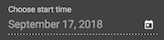 lets you select the start time of the range.
The next input lets you select the end time of the range. This input has two options:
-
"Now" means that the charts will be continually updated with the most recent data.
-
"Custom" lets you select a fixed date. The time range is historical, so the charts will be static.
The sliding bar on the right lets you fine tune the range. Click and drag an endpoint to adjust the start or end time.
Changing any of these selections will trigger a request for statistics data and the chart will be re-rendered accordingly.
Charts
Each chart displays some statistic or states information on the vertical axis and time on the horizontal axis.
There are two chart sections. The first section is GSQL Query Performance. This lists all of the queries accessible to the current user. If you click on a query name, the display will expand to show detailed charts about that query. You can expand only one query panel at a time. The second section is Cluster Monitoring. This lists all of the machines within the TigerGraph cluster. Similar to the first section, you can only expand one panel at a time.
.png)
A Query Monitoring Panel includes three charts:
-
QPS (number of queries completed per second)
-
Timeout (fraction of the query calls which timed out and therefore did not finish)
-
Latency (minimum, maximum, and average time to complete a query)
.png)
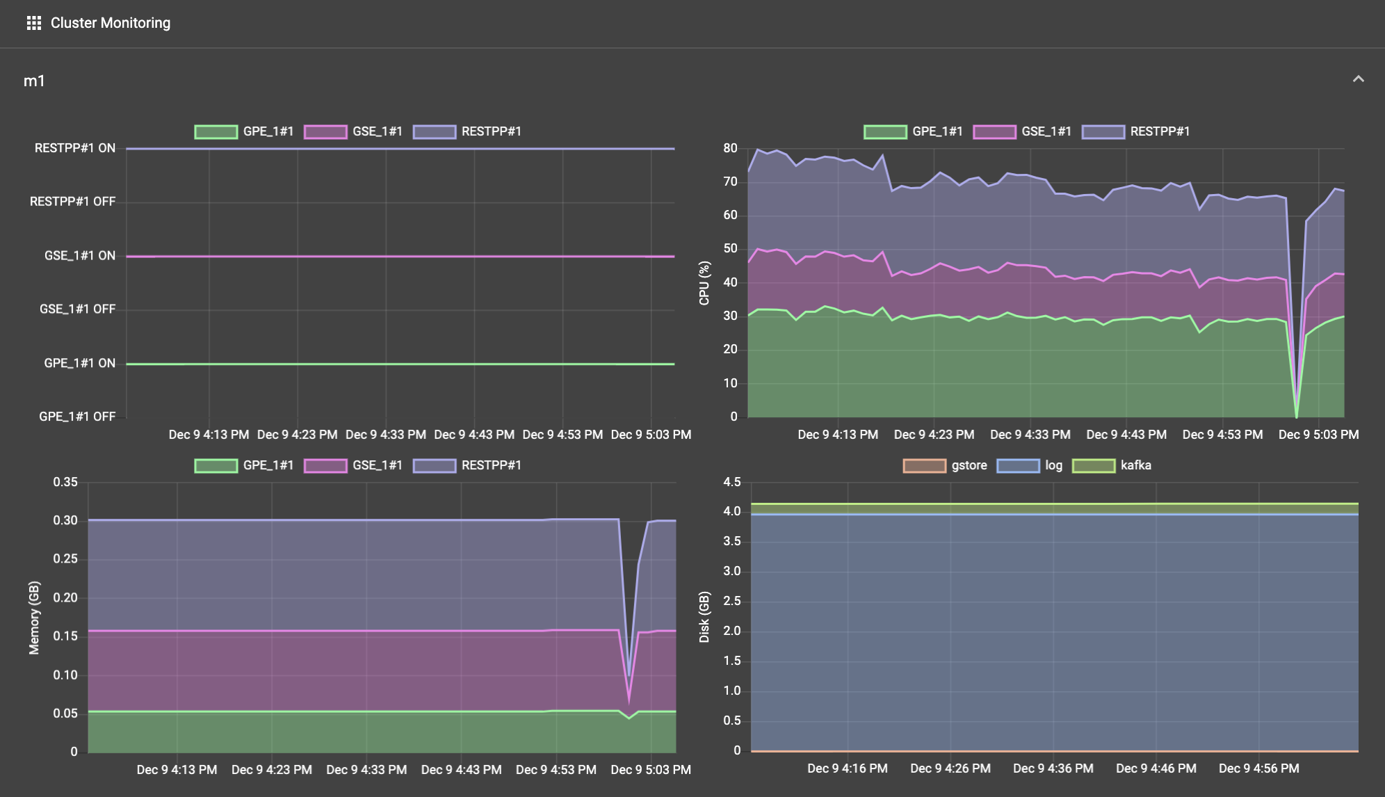
A Machine Monitoring Panel includes 4 charts. The first three charts break down the information among three processing-focused components (GPE, GSE, RESTPP). The last chart breaks down information among three components which may have large storage needs (GStore, Log files, and Apache Kafka).
-
Service status: ON or OFF status for the given component
-
CPU Usage: percentage of available CPU time used by the given component
-
Memory Usage: GB used by the given component
-
Disk Usage: GB used by the given component