Scatter Chart Widget
The Scatter Chart will provide a visual representation of the relationship between two numerical variables, allowing users to identify patterns or correlations in the data.
Introduction
As a user of TigerGraph Insights, You can have a Scatter Chart widget available in the dashboard.
-
Users are able to select the X-axis and Y-axis variables from the available data fields.
-
It supports tooltips to display additional information when hovering over data points.
-
It can be interactive, allowing users to zoom in/out and pan across the chart.
-
It can have customizable styling options, such as colors and marker shapes.
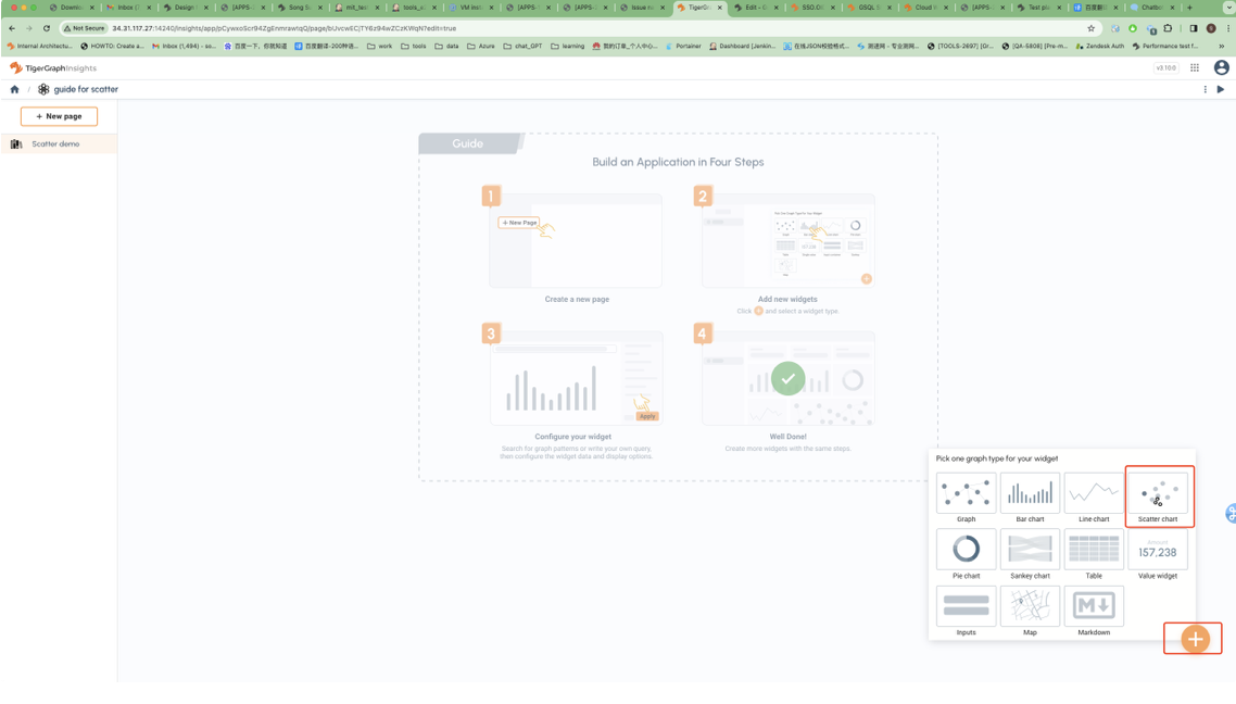
Create a Scatter Chart Widget
-
Click Scatter Chart Widget.
-
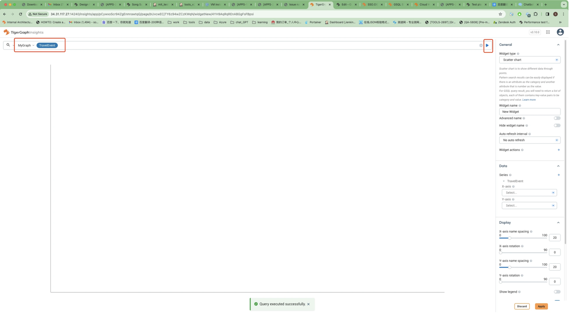
Run the pattern.
-
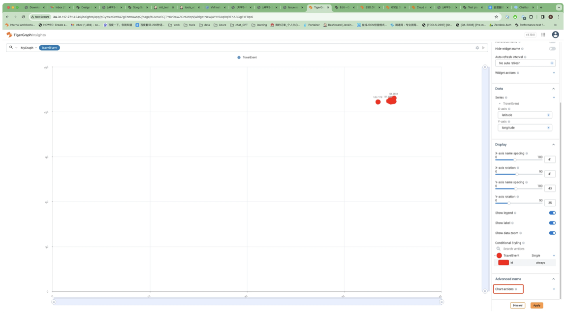
Select X/Y-axis
Datato show in chart.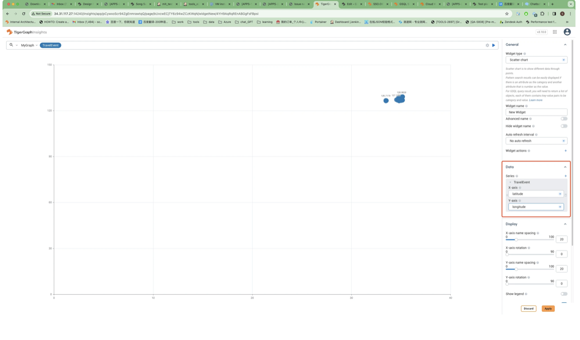
-
Adjust X/Y-axis style in the
Display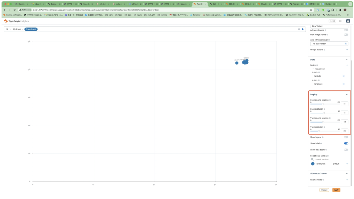
-
Open show options.
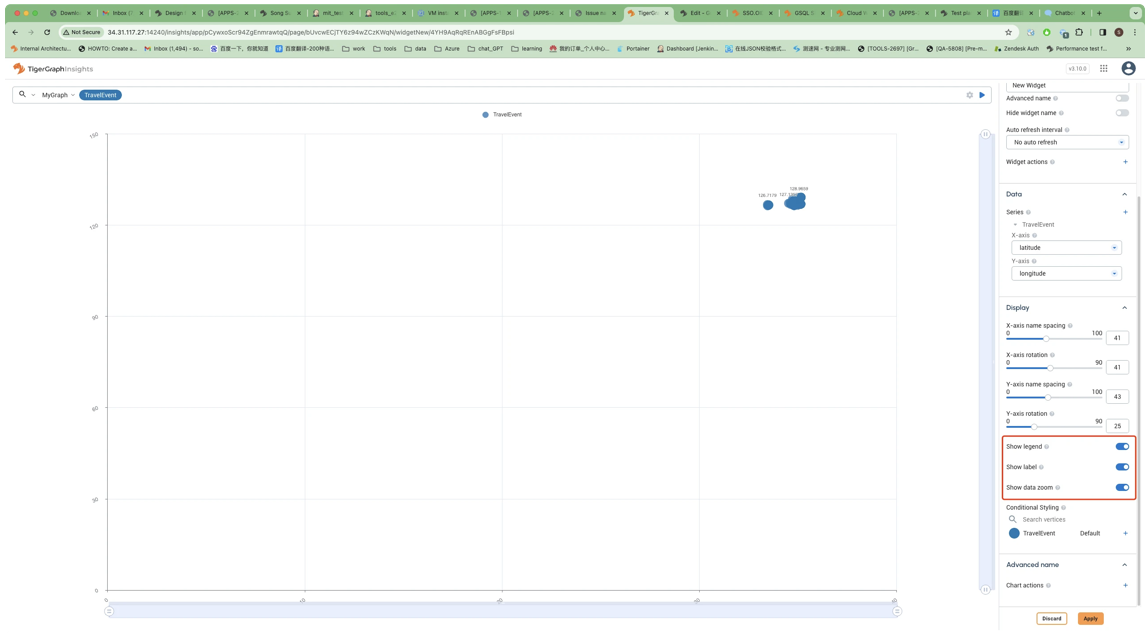
-
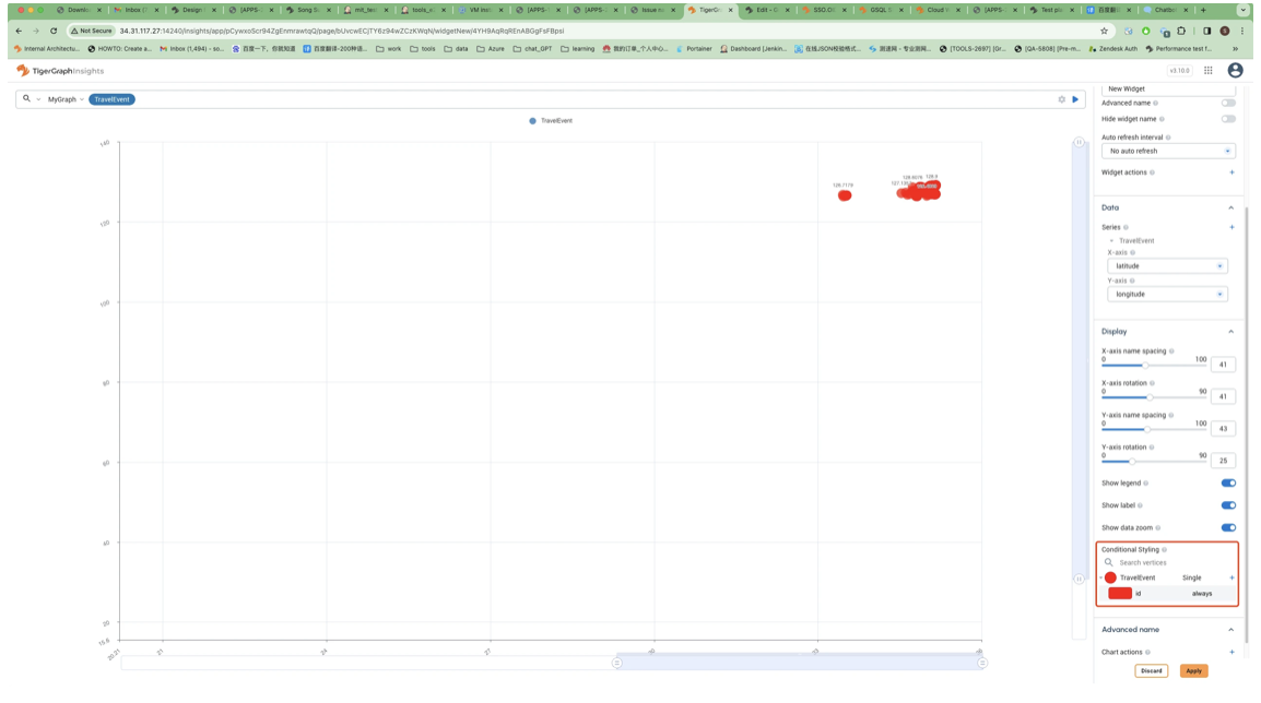
Add Conditional Styling.
-
Add some action to the chart.